Model Your Visit: Process
by Tim Parsons and Jessica Charlesworth
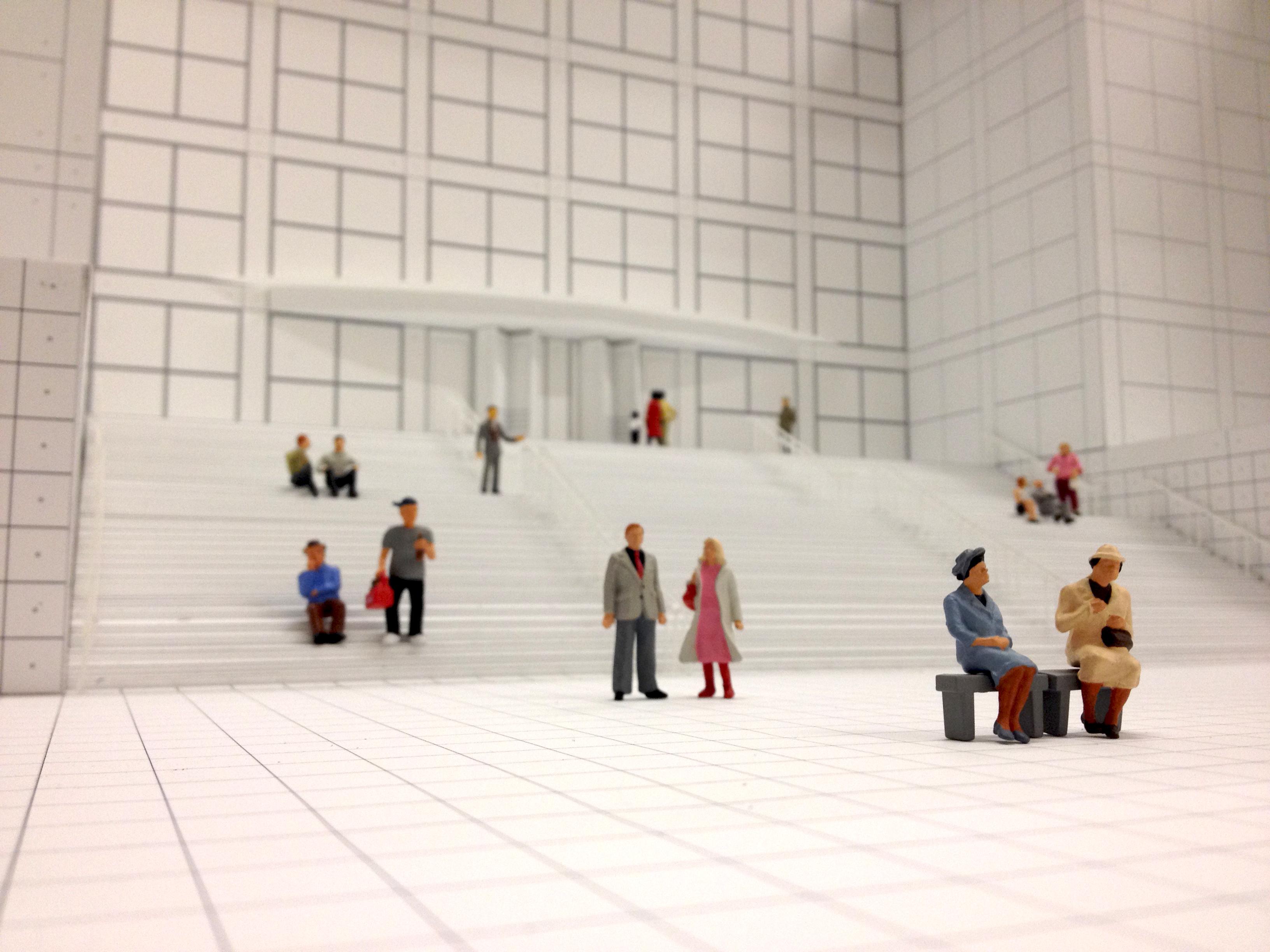
All images: Model Your Visit model
Courtesy of the authorsTim Parsons and Jessica Charlesworth of Chicago-based design studio Parsons & Charlesworth were commissioned by the MCA's Education Department to design their latest publication titled Model Your Visit. The first in a series of three, Model Your Visit uses scale models of the museum as a backdrop to tell the stories of three fictional characters, each of whom have different ways of experiencing the museum. Tim Parsons explains a little of the process behind the project.
About
Having seen the first series of educational maps by our friends Lisa Smith and Caroline Linder of ODLCO, which used the idea of the cutaway drawing, we were very excited to get the commission to undertake the next series. When considering our approach, we were keen to acknowledge and build upon the success of ODLCO’s series by retaining the focus on the building as the means for prompting interactions within the museum, but we developed our own graphic treatment.
About
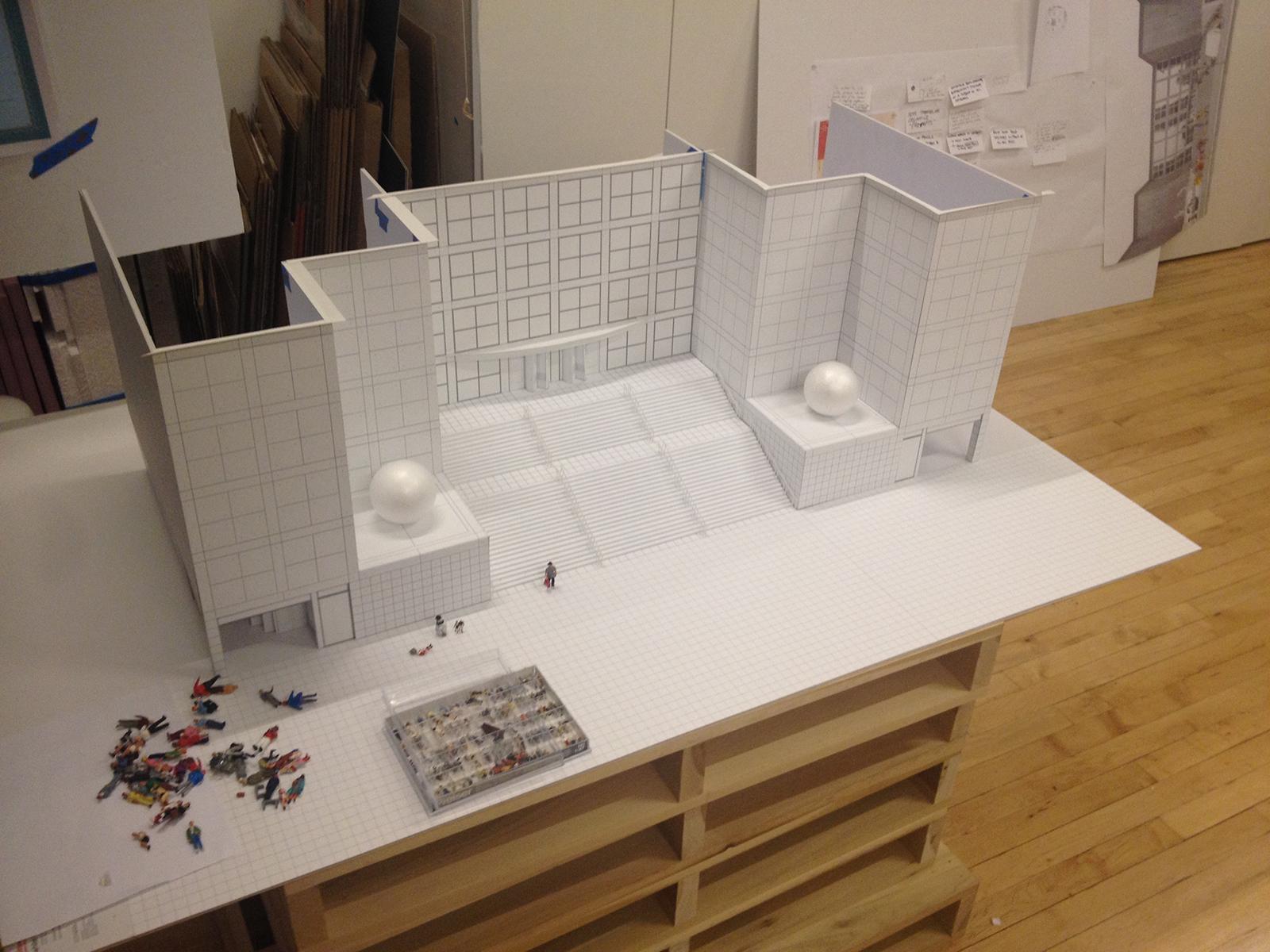
Our proposal was based around the creation of a physical-scale model of the building that would provide an ongoing stage-set for the representation of activities inside the museum. In the end we created five different models to photograph for the piece.
About
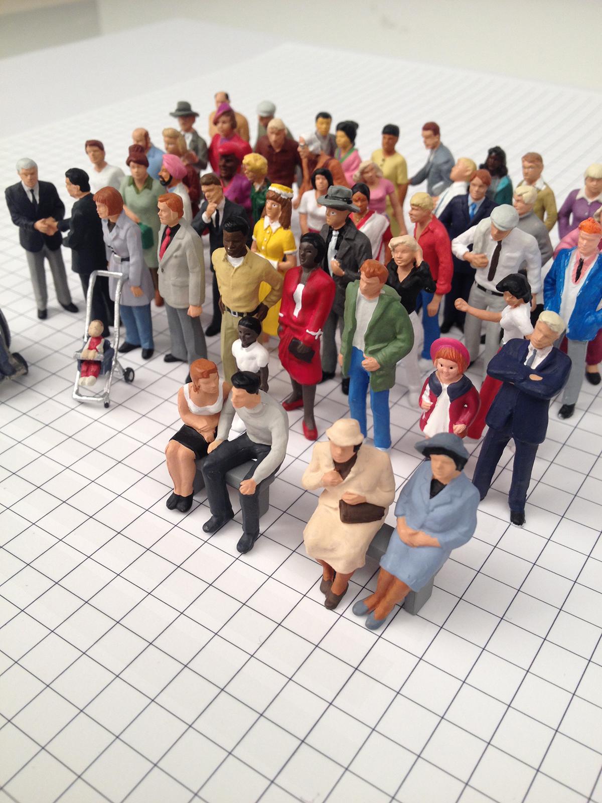
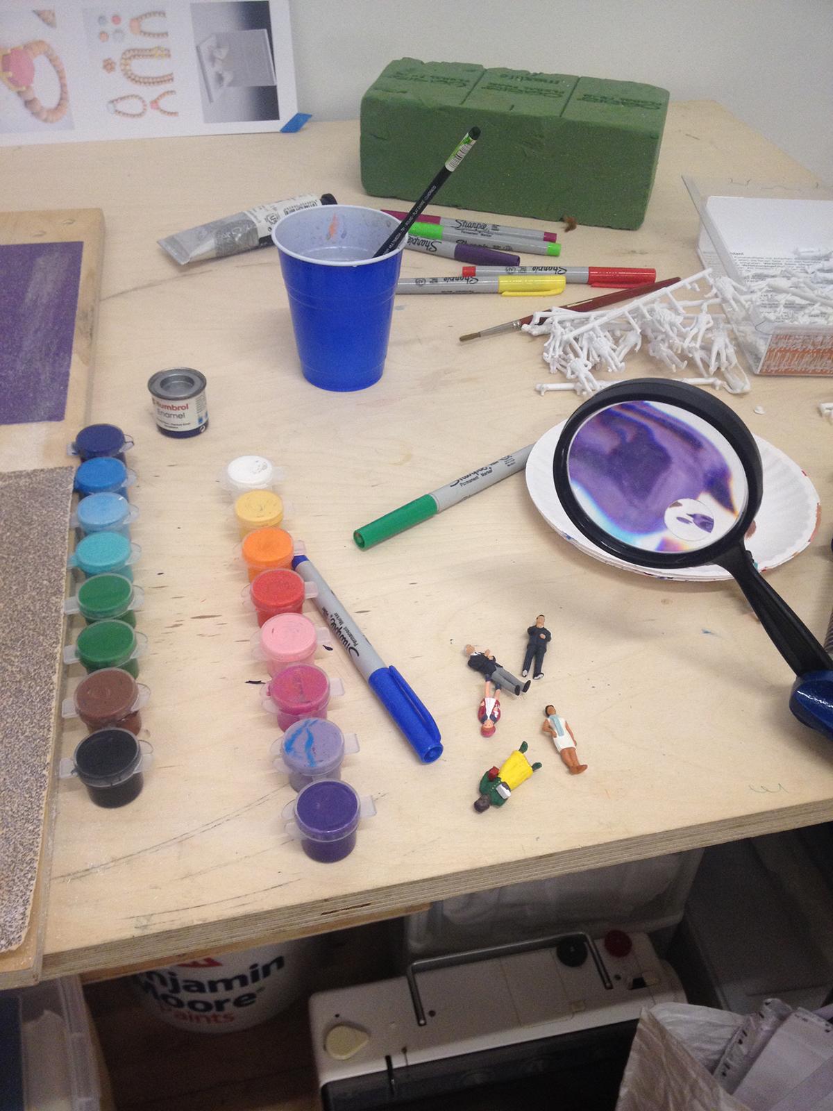
These were populated by figures similar to those used by model railway enthusiasts, most of which were made by the German company Preiser.
About
The building models are made at 1:50 scale from white card and foam board. The process was quite time-consuming but enjoyable. The MCA has a very detailed CAD model of the museum that it allowed us to use. Once we had defined the scenes we wanted to create, we could isolate faces of the CAD model and print them to scale onto card. We then mounted these onto foam board, cut them out, and assembled them.
There were some tricky sections, like the curving stairs leading up from the fishpond, but it was a fun challenge!
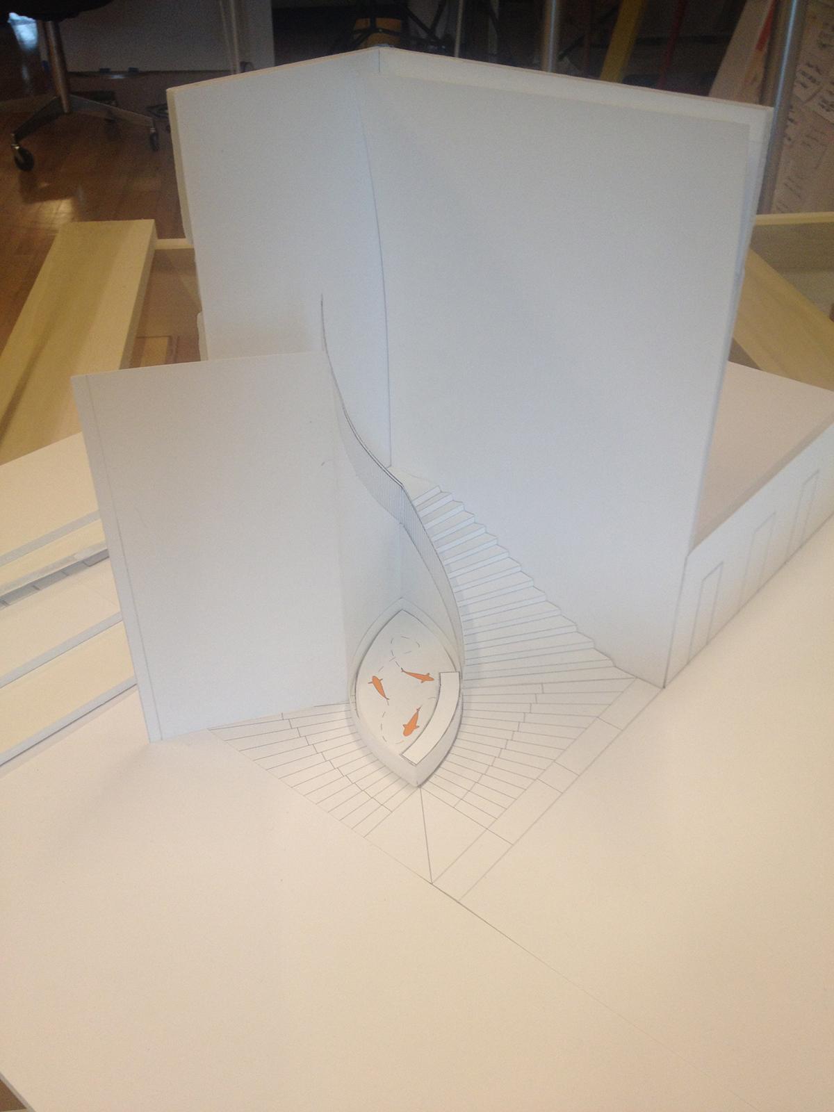
About
The models are like old Hollywood film sets—they look good from the front, but behind they are all glue and masking tape. We intentionally left them white so that the viewer’s eye would be drawn to the colored figures and the graphic elements that would be overlaid on top. Finally, we lit the scenes and photographed them to provide images for each page of the guide.
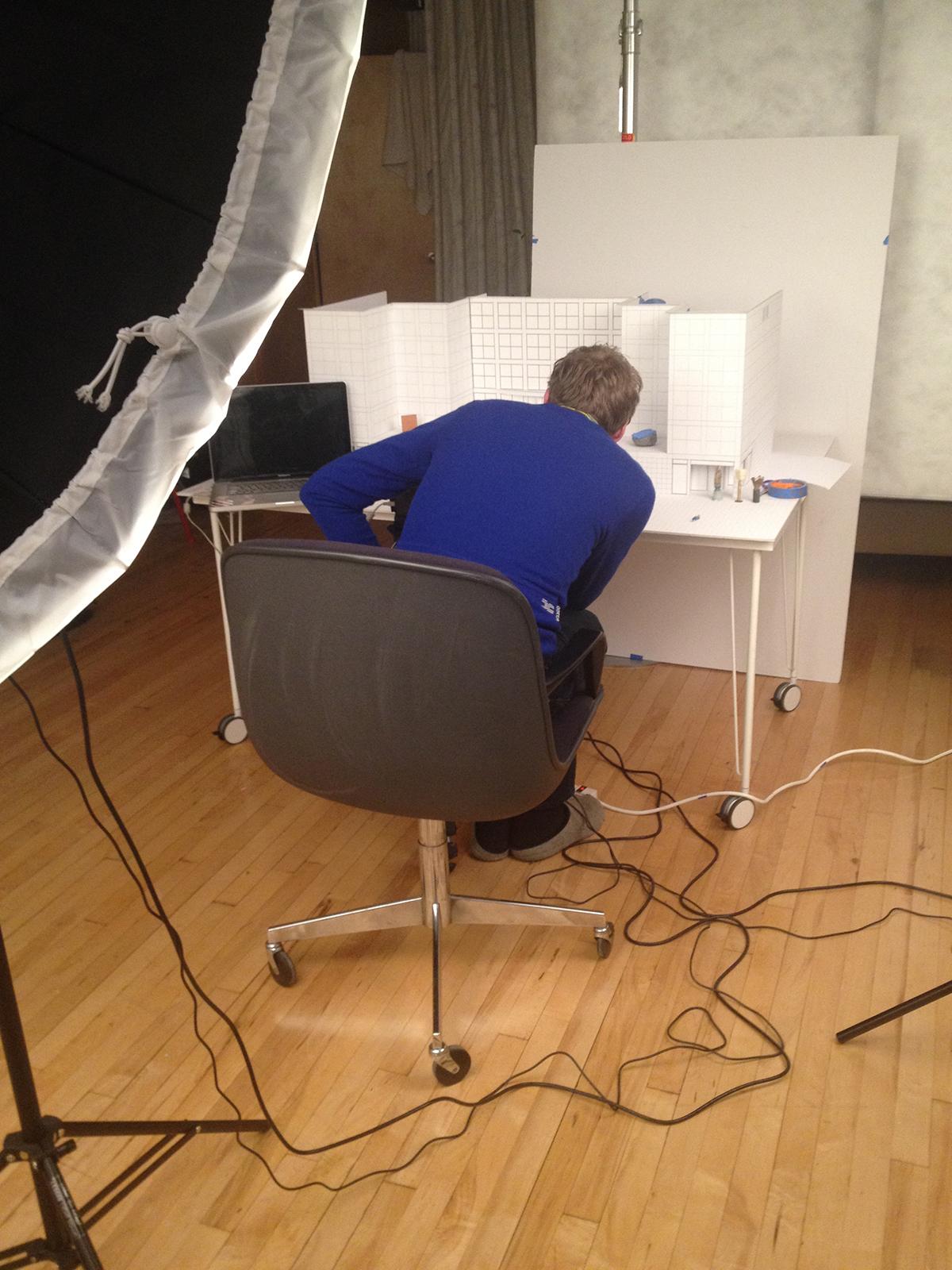
About
For the inside of the guide, which opens out to show one large image of the front of the museum, we tried to set up as many figures as possible in natural-looking poses. There are couples, groups, families, children, someone in a wheelchair, a mother with a pram sitting on the steps, people walking their dogs, etc. We also created scale sculptures for the plinths on either side of the stairs and the plaza, and invented fictional exhibition posters with the help of Bryce Wilner from the MCA’s Design, Publishing, and New Media Department, who also designed the typographic treatment and graphic identity for the guide. It’s been a lot of fun to work on and we’re looking forward to creating more models and stories for the next installment.